Bokus is a Swedish based online book store. Even though digital books are all the rage right now there is still a place in some peoples hands for the printed page.
The main problem was that the majority of the content within the Bokus communication is images of books, and of course the look/design of these is purely out of the control of Bokus. So how does one control an identity when something out of ones control becomes the major part of it.
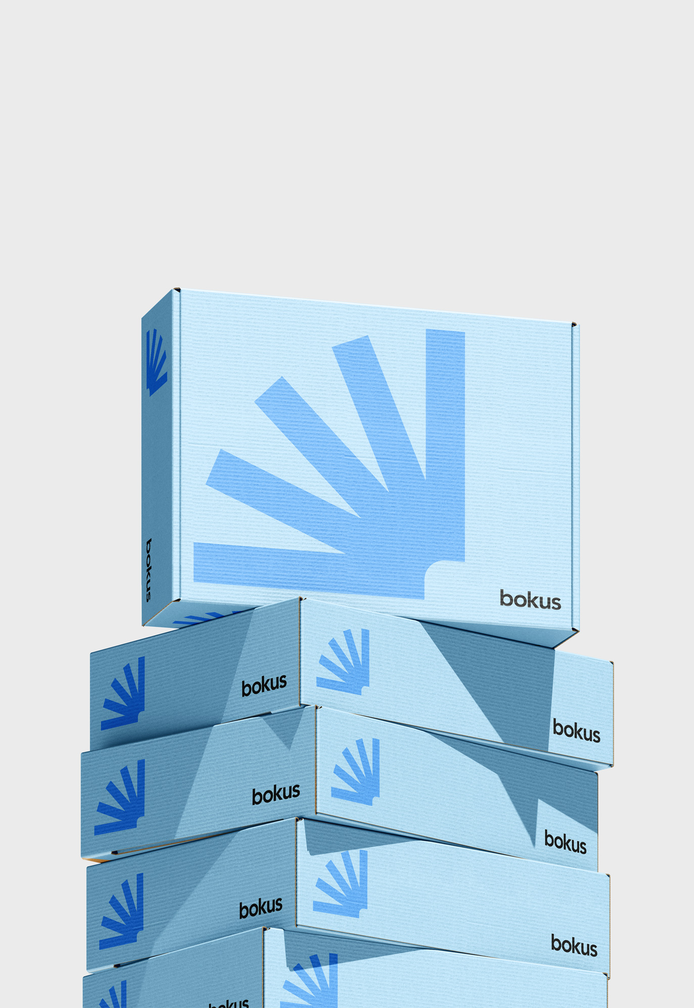
The answer, keep things simple and focus on the essence of what Bokus is. The promotion of the physical book. We designed a simple shape representing an open book that could be applied to all communication and act as a strong brand character. Together with a bright colour world, characterful typeface and a consideration to how the elements are used, Bokus now have an identity that stands out from the competitors and focuses on the ‘real’ book.